Fall in Michigan is more than a season—it’s a sensory experience. From the fiery reds of sugar maples to the muted golds of cornfields, the landscape becomes a living canvas that evokes warmth, nostalgia, and natural beauty. For brands and designers working with Michigan audiences, capturing this seasonal magic through a thoughtfully crafted color palette can elevate everything from logos and websites to social media campaigns and print collateral.
In this article, we’ll explore how to build a fall color palette that resonates with Michigan’s regional identity, emotional tone, and visual preferences. Whether you’re a local business, creative agency, or marketing consultant, understanding the power of seasonal color can help you connect more deeply with your audience—and stand out in a crowded market.
Why Color Palettes Matter in Michigan Branding
A strategic color palette is more than aesthetic—it’s psychological. Colors influence perception, emotion, and behavior. In Michigan, where fall is associated with harvest festivals, football games, and scenic drives, the right color palette can evoke familiarity, trust, and regional pride.
Benefits of a seasonal color palette include:
- Emotional resonance with local audiences
- Increased engagement across digital platforms
- Stronger brand recall and visual cohesion
- Enhanced storytelling through design
Michigan audiences respond to visuals that reflect their environment. A fall color palette rooted in local tones can make your brand feel grounded, authentic, and timely.
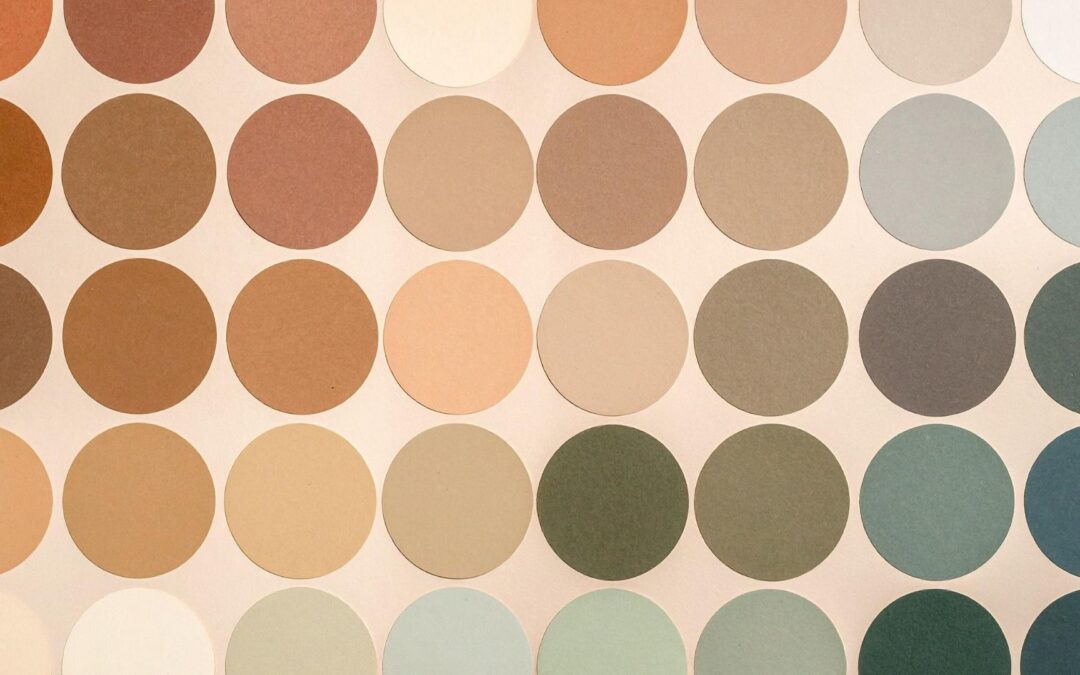
The Psychology Behind Fall Color Palettes
Let’s break down the emotional impact of common fall hues and how they contribute to a compelling color palette:
| Color | Emotion/Association |
| Burnt Orange | Energy, creativity, autumn leaves |
| Deep Red | Passion, warmth, harvest |
| Mustard Yellow | Optimism, nostalgia, golden light |
| Olive Green | Nature, grounding, renewal |
| Chocolate Brown | Stability, comfort, earthiness |
| Slate Gray | Sophistication, calm, transition |
| Navy Blue | Depth, trust, Great Lakes influence |
These colors work beautifully in combination, creating a color palette that feels both seasonal and versatile. When used intentionally, they guide the viewer’s eye, evoke specific moods, and reinforce your brand’s message.
Regional Color Preferences in Michigan
Michigan’s geography and culture shape its visual language. From the Upper Peninsula’s rugged forests to the Lower Peninsula’s farmland and lakeshores, fall in Michigan offers a rich palette of inspiration.
1. Lake-Inspired Blues and Grays
Cool tones like navy, slate, and misty gray reflect Michigan’s Great Lakes and overcast skies. These hues add depth and calm to any color palette.
2. Woodland Earth Tones
Deep greens, browns, and rust tones mirror the forests and trails that define Michigan’s fall landscape. These colors ground your color palette in nature and authenticity.
3. Golden Hour Highlights
Warm yellows and soft oranges evoke the glow of late-afternoon sunlight—a beloved feature of Michigan’s autumn days.
4. Cider Mill Reds
Rich reds and burgundy tones call to mind apples, barns, and cozy flannel—staples of Michigan’s fall culture.
By incorporating these elements into your color palette, you create visuals that feel familiar, comforting, and locally relevant.
How to Build a Fall Color Palette
Creating a seasonal color palette doesn’t mean abandoning your brand identity. Instead, it’s about layering seasonal accents that complement your core colors.
Step 1: Start with Your Brand Colors
Identify your primary brand colors and choose fall tones that harmonize with them. For example, if your brand uses navy blue, pair it with burnt orange or mustard yellow.
Step 2: Choose a Dominant Seasonal Hue
Select one fall color to lead your palette—this will be the most prominent in your visuals.
Step 3: Add Supporting Neutrals
Use warm neutrals like taupe, cream, or slate gray to balance bold colors and maintain readability.
Step 4: Test for Accessibility
Ensure your color palette meets contrast standards for readability, especially in digital formats.
Step 5: Apply Consistently
Use your palette across all platforms—website, social media, email, and print—to create a cohesive seasonal experience.
Where to Use Your Fall Color Palette
Once you’ve built your color palette, it’s time to put it to work. Here are key areas to apply seasonal colors:
- Website banners and buttons
- Social media graphics and stories
- Email headers and CTAs
- Print flyers and postcards
- Video overlays and thumbnails
- Packaging and signage
Consistency is key. A unified color palette helps reinforce your message and makes your brand instantly recognizable across touchpoints.
Tools for Exploring Color Palettes
Need help finding the perfect fall tones? Try these tools:
- Coolors: Generate and customize palettes quickly
- Adobe Color: Explore trending seasonal themes
- Canva Color Wheel: Match complementary hues for design balance
- Pantone Fall Reports: Discover industry-standard seasonal palettes
These resources can help you experiment with combinations and visualize how your color palette will look in real-world applications.
Integrating Color with Branding Strategy
Your color palette should support—not compete with—your brand identity. Here’s how to integrate seasonal colors without diluting your message:
- Use seasonal colors as accents, not replacements
- Maintain your logo’s integrity, but adapt surrounding visuals
- Create seasonal templates for social and email that reflect your fall palette
- Highlight seasonal services or promotions using fall tones to draw attention
This approach allows you to stay on-brand while still embracing the emotional power of seasonal design.
Real-World Example: A Michigan Service Brand
Let’s say a Michigan-based home service company wants to promote fall maintenance packages. A strategic color palette might include:
- Dominant Color: Burnt orange (leaves, energy)
- Accent Color: Olive green (nature, renewal)
- Neutral Base: Slate gray (professionalism, calm)
- Highlight: Mustard yellow (warmth, visibility)
This palette reflects Michigan’s fall landscape while reinforcing the company’s connection to nature and professionalism. It can be used across their website, social media, and print materials to create a unified seasonal campaign.
Tips for Designers and Marketers
If you’re guiding a team or working with clients, here are a few best practices for using a fall color palette effectively:
- Present mood boards that show the palette in context
- Use regional photography to reinforce color choices
- Test palette variations for different platforms (print vs. digital)
- Invite feedback and iterate based on audience response
- Document the palette in brand guidelines for consistency
A well-documented color palette becomes a powerful tool for collaboration, clarity, and long-term brand growth.
Ready to Refresh Your Brand for Fall?
A thoughtful color palette can transform your marketing from generic to unforgettable. Whether you’re launching a seasonal campaign or simply want to connect more deeply with Michigan audiences, fall is the perfect time to refresh your visuals and tell your story through color.
Contact WebHorse Marketing to explore seasonal branding, design updates, or fall marketing strategy. Their team specializes in helping Michigan businesses create visuals that resonate, inspire, and convert.
Let your brand reflect the beauty of Michigan’s fall—and watch your audience respond with warmth, trust, and engagement.
Recent Comments